Romantic · From the Tryoom app
Soft Color Palettes That Aren't Boring
Soft colors get accused of being washed out, faded, or blah. That's a styling problem, not a color problem. Texture and contrast make them sing.
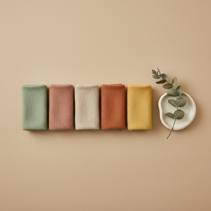
Soft Color Palettes That Aren't Boring
Soft colors get accused of being washed out, faded, or "blah." That's a styling problem, not a color problem. The fix is texture and contrast, both of which the matte same-toned outfit you keep seeing on Pinterest is missing.
The five soft colors that work
- Sage green: grounded, modern, flattering on most skin tones.
- Dusty rose: warm, romantic, less expected than blush.
- Warm oat / oatmeal: the sophisticated cousin of beige.
- Terracotta: warm enough to flatter, soft enough to layer.
- Soft butter yellow: the most underused. Reads optimistic without being saccharine.
The texture rule
Soft colors fall flat when they're matte, smooth, and same-toned. Add texture and they come alive.
- Sage in a chunky cable knit beats sage in a flat jersey tee.
- Dusty rose in silk satin beats dusty rose in cotton poplin.
- Oat in raw linen beats oat in a smooth synthetic.
Pairings that read intentional
- Sage + cognac leather. The classic warm-cool balance.
- Dusty rose + black or charcoal. Stops the rose from reading childish.
- Oat + denim. Casual and considered at the same time.
- Terracotta + cream. Tonal warm, like a desert palette.
- Butter yellow + grey. Spring meets office.
The mistake to avoid
Soft colors plus soft colors plus soft colors equals visual mush. Always include one anchor: a charcoal trouser, a dark denim, a black accessory. The anchor lets the soft colors pop instead of dissolving into one watercolor wash.
The skin-tone check
- Cool undertones shine in sage, dusty rose, soft lavender.
- Warm undertones are flattered by terracotta, butter yellow, oat, peach.
- Neutral undertones can wear all five.
The accessory rule
Soft outfit + bold lip color + structured bag = pulled-together. Soft outfit + soft accessories = forgettable.